
Soul Healing
Brand Identity & Website Design
A bold, community-driven brand identity for a therapy and clinical hypnotherapy practice — combining ancient healing symbolism with an unapologetically modern aesthetic.
Situation
Healing for the Soul Therapy & Training needed a brand identity and website that stood apart from the sterile, clinical aesthetics dominating the mental health space. Founder Natasha Daniels wanted a brand that felt loud, innovative, and community-centered — healing that has edge. The logo needed to fuse three deeply personal symbols: a lotus, a heart, and a hummingbird.
Task
Create a full brand identity system including logo design across two refinement batches, a comprehensive brand guide, and a website design and Wix build. The visual system needed to serve both individual therapy clients and corporate training audiences while embodying the brand's core metaphor: 'Healing like Ginger Ale — spicy, tangy, and self-healing.'
Action
Symbolic Continuous-Line Logo
The logo fuses three client-requested symbols — a hummingbird (resilience and lightness), a heart (compassion and emotional healing), and a lotus (transformation through adversity) — into a single continuous-line mark. Two design batches refined the proportions, stroke weights, and color expression across six variants until the mark felt both clinically credible and warmly human.
Continuous-line design conveys unity and the interconnected nature of mind-body-soul healing.
Brand Color Philosophy
We anchored the palette in Deep Forest Green (#1A6B35) and Light Sage (#C5E1A5), evoking growth, nature, and the restorative quality of green spaces. A Warm Orange accent (#E8652A) was introduced sparingly for high-energy moments — reflecting the 'ginger ale' brand metaphor. Warm neutrals (cream, charcoal) round out a palette that reads both luxurious and grounded.
60% neutrals, 35% greens, 5% warm orange keeps the identity rooted yet distinctly alive.
Website Design & Wix Build
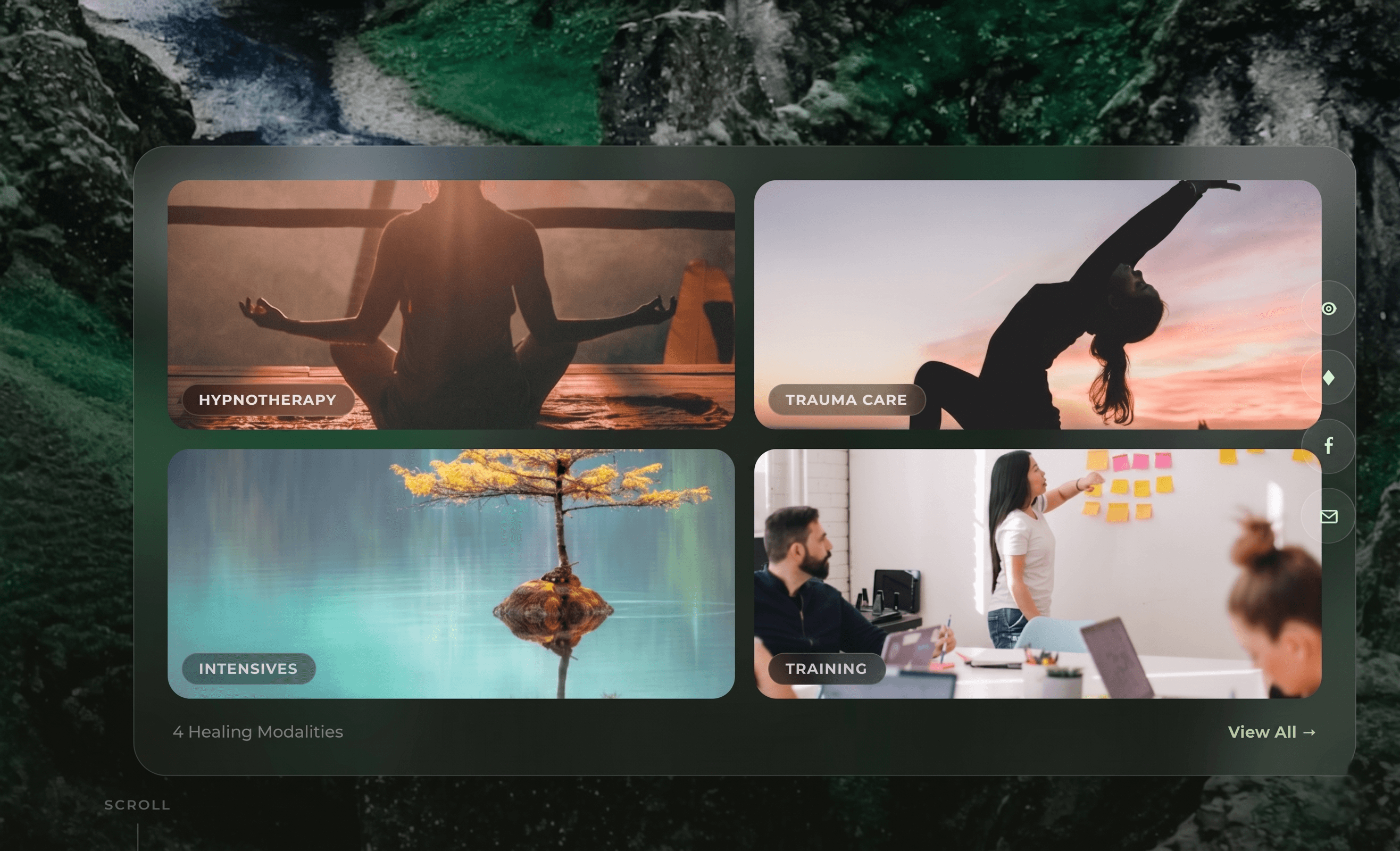
The website was designed around a dark, cinematic hero with lush tropical imagery, transitioning into warm content sections. Full layout design was delivered across home, services, and contact pages — with a complete photography direction guide, typography system (Playfair Display / Montserrat), and all section compositions. The design was then built on Wix with a live preview delivered to the client.
Design references the 'Serenity' aesthetic — dark luxury backgrounds with warm gold and cream tones.
Result
Soul Healing launched with a distinctive visual identity that stands apart in the therapy space. The continuous-line logo mark, forest green palette, and cinematic website design position the practice as innovative and premium — attracting the exact audience of women seeking healing that goes beyond traditional clinical aesthetics.
Project Showcase
What We Created
- Primary Logo — Full Color, White & Monochrome Variants
- Logo Icon / Monogram Mark
- Brand Identity Guide
- Color Palette & Typography System
- Photography Direction
- Website Design & Mockup
- Wix Website Build
Next Project

Atlanta Indian Film Festival
Event Branding